Aura Dashboards
Data Analysis and Visualization
Role
UX/UI Designer
Industry
Data
Duration
3 months
Wireframe design
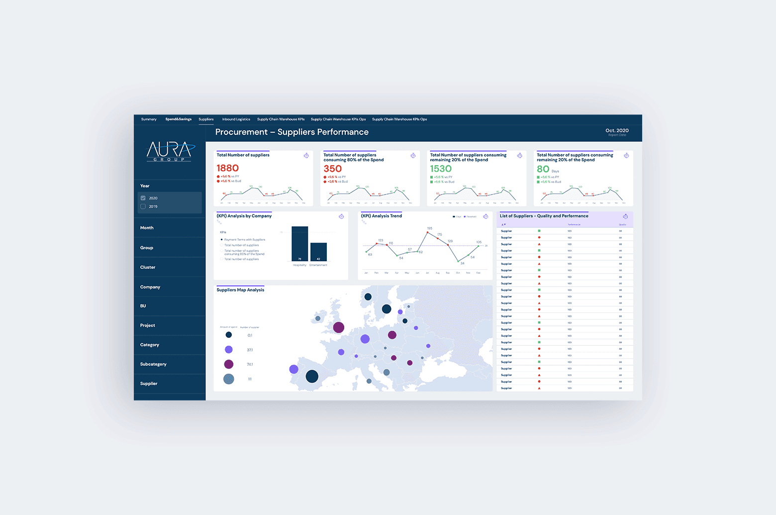
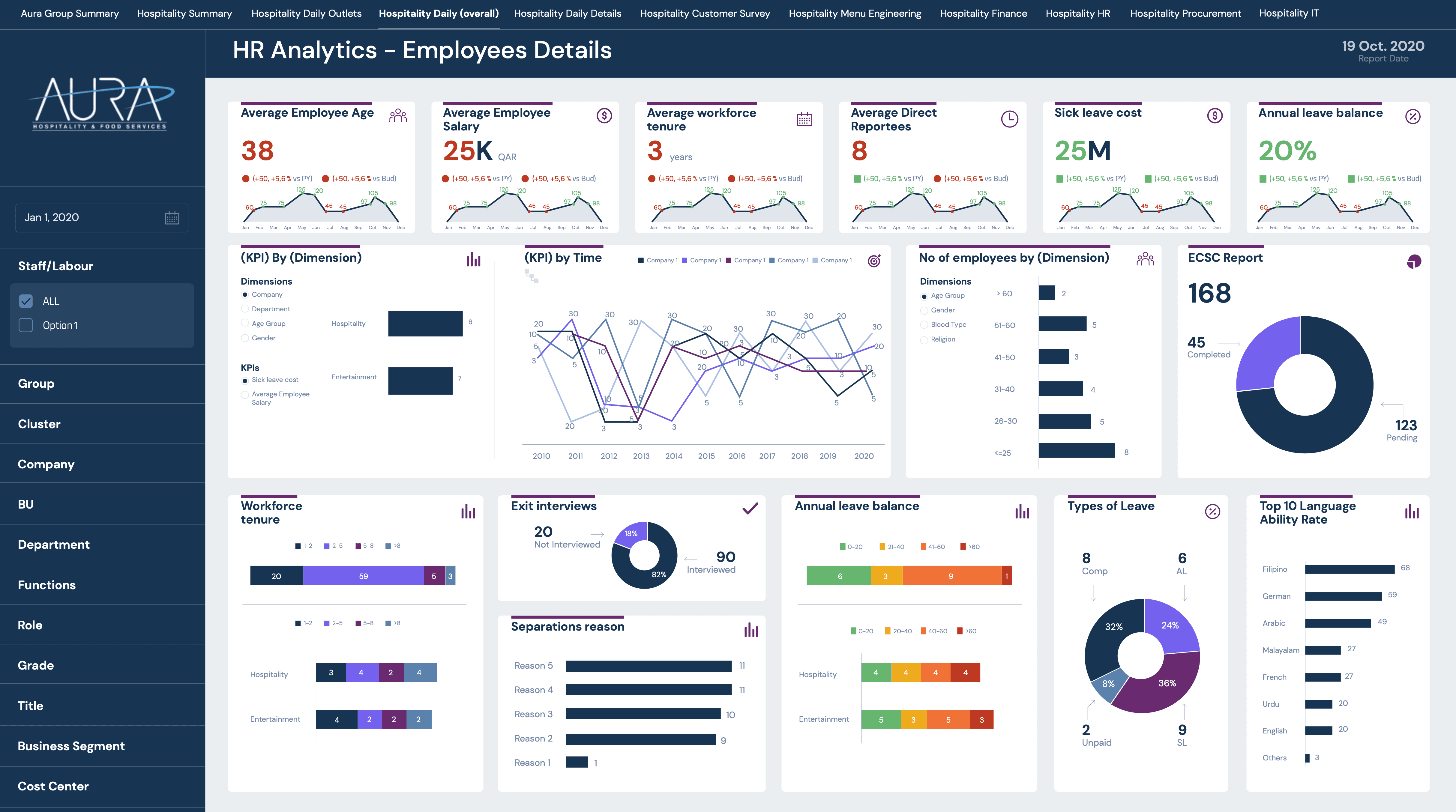
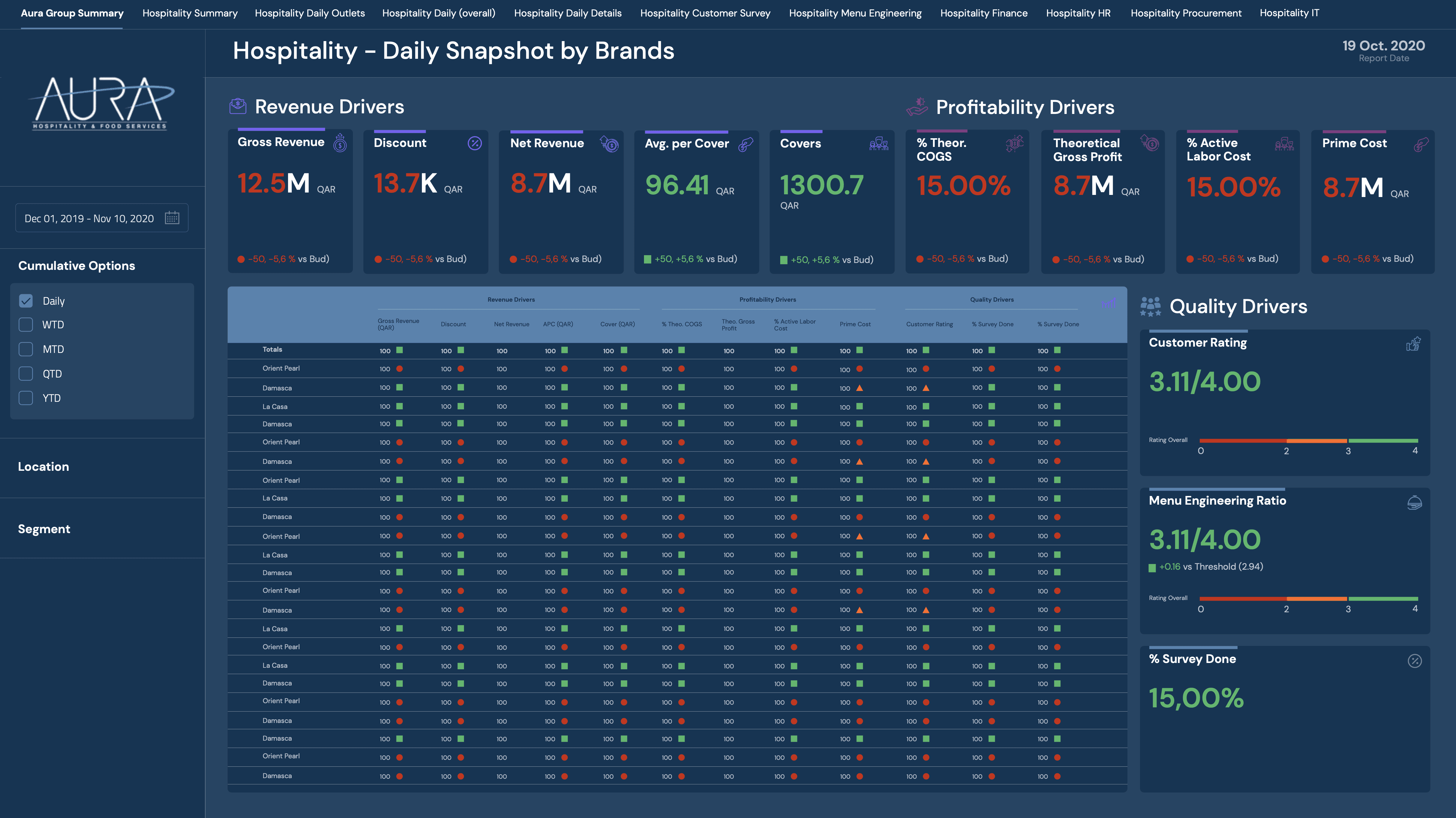
To effectively organize and present all the data on the pages, an information structuring process was first carried out in collaboration with data analysts. During this stage, hierarchies were defined, relationships between different data sets were established, and the best way to visualize them was determined to enhance understanding. Once this structure was in place, wireframes were created, serving as the foundation for designing an interface.

Visual design
The visual design of dashboards aims to make information clear, understandable, and easy to interpret. After defining the structure and wireframes, the focus shifts to the aesthetics and functionality of the interface to ensure an intuitive user experience.
A well-balanced color palette with good contrast, readable typography, and appropriate visualizations (bar charts, line graphs, tables, etc.) are selected. Additionally, visual hierarchies are established using size, color, and white space to highlight key data.


Other projects
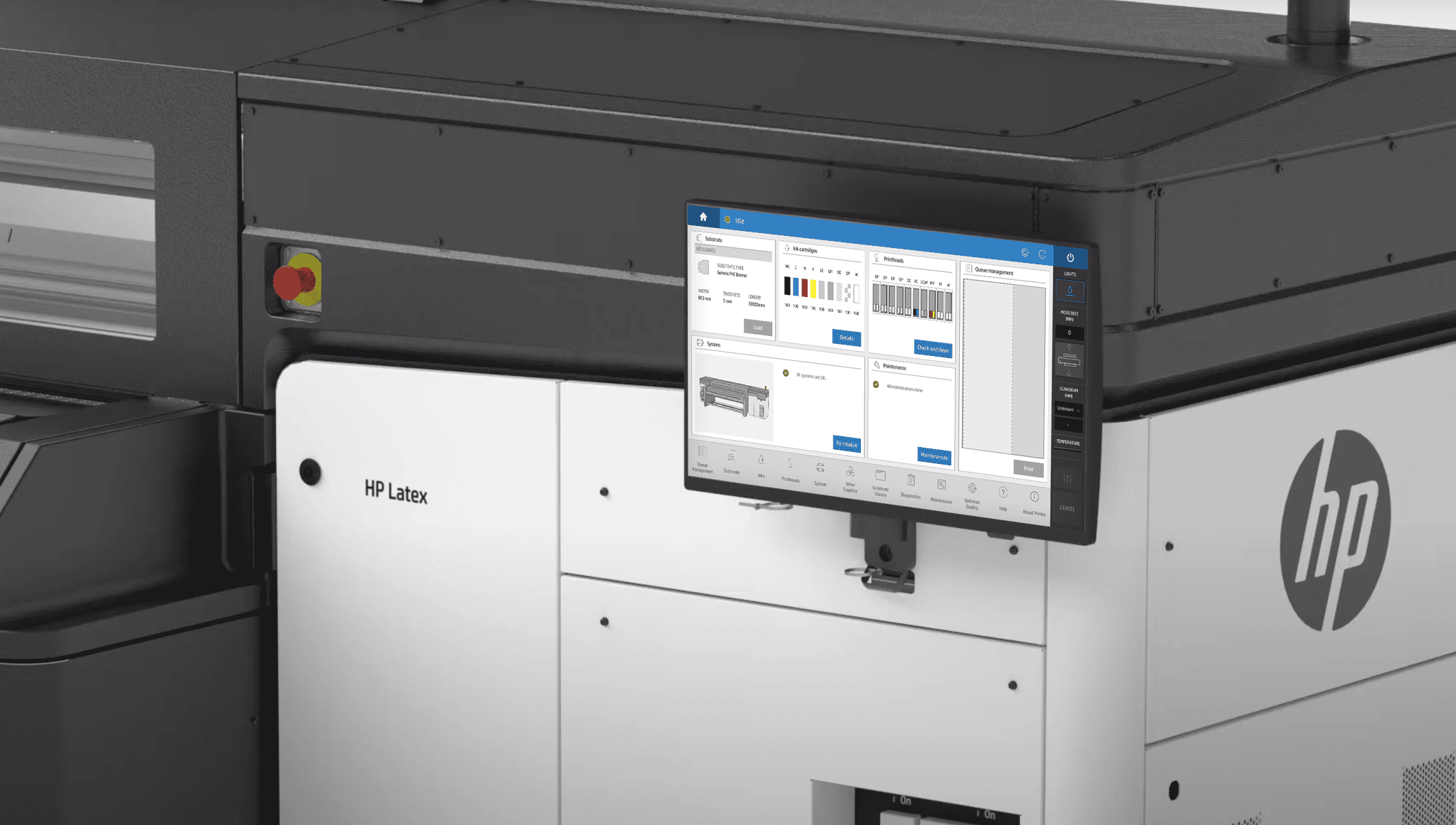
HP Printing software
Design of print management software for large format printers.
Full Syllabus
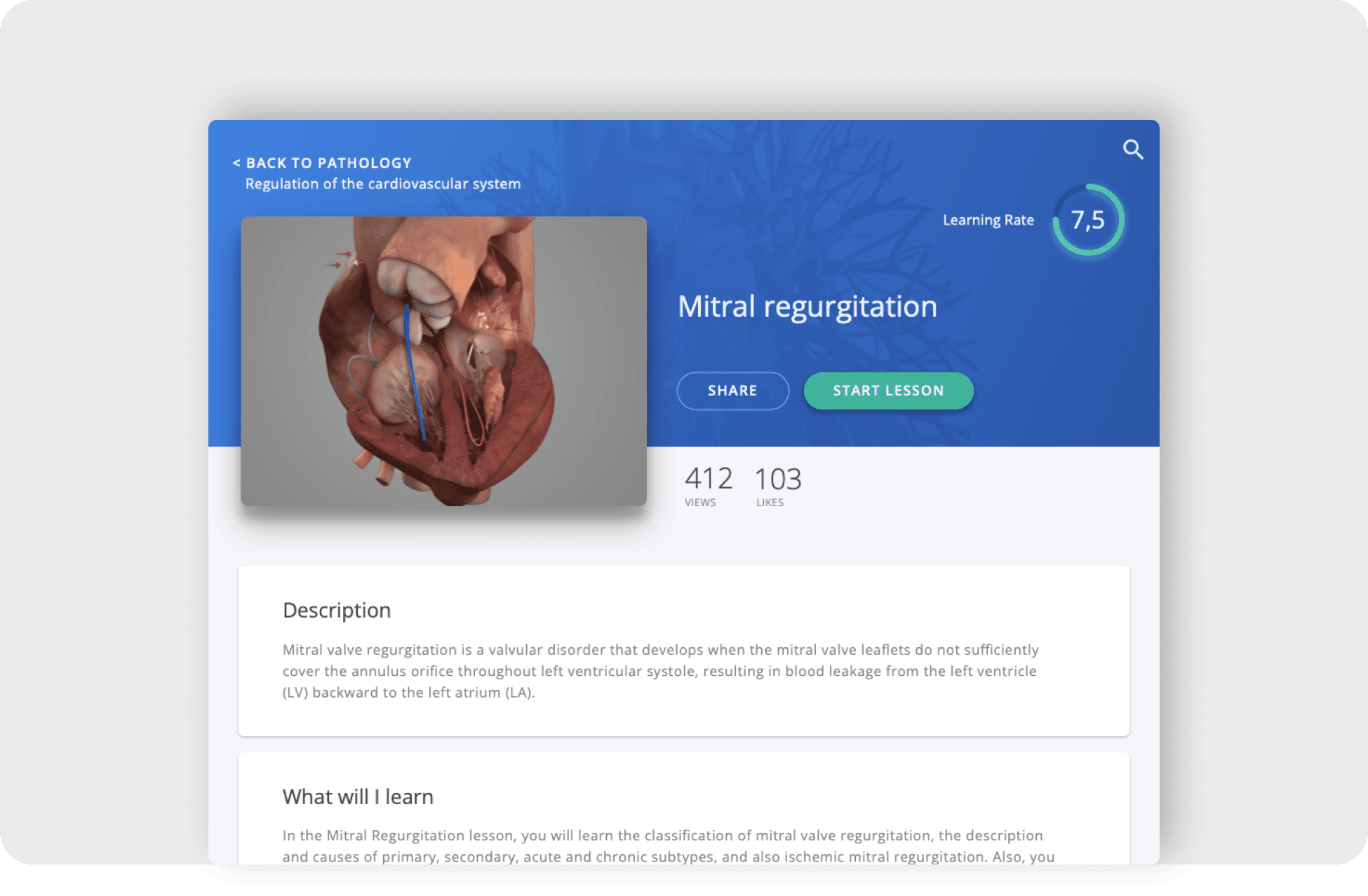
Scientific-medical e-learning application developed for medical students.

Privalia - Vepee
Exploring new ways to interact with flash deals in a Marketplace app.
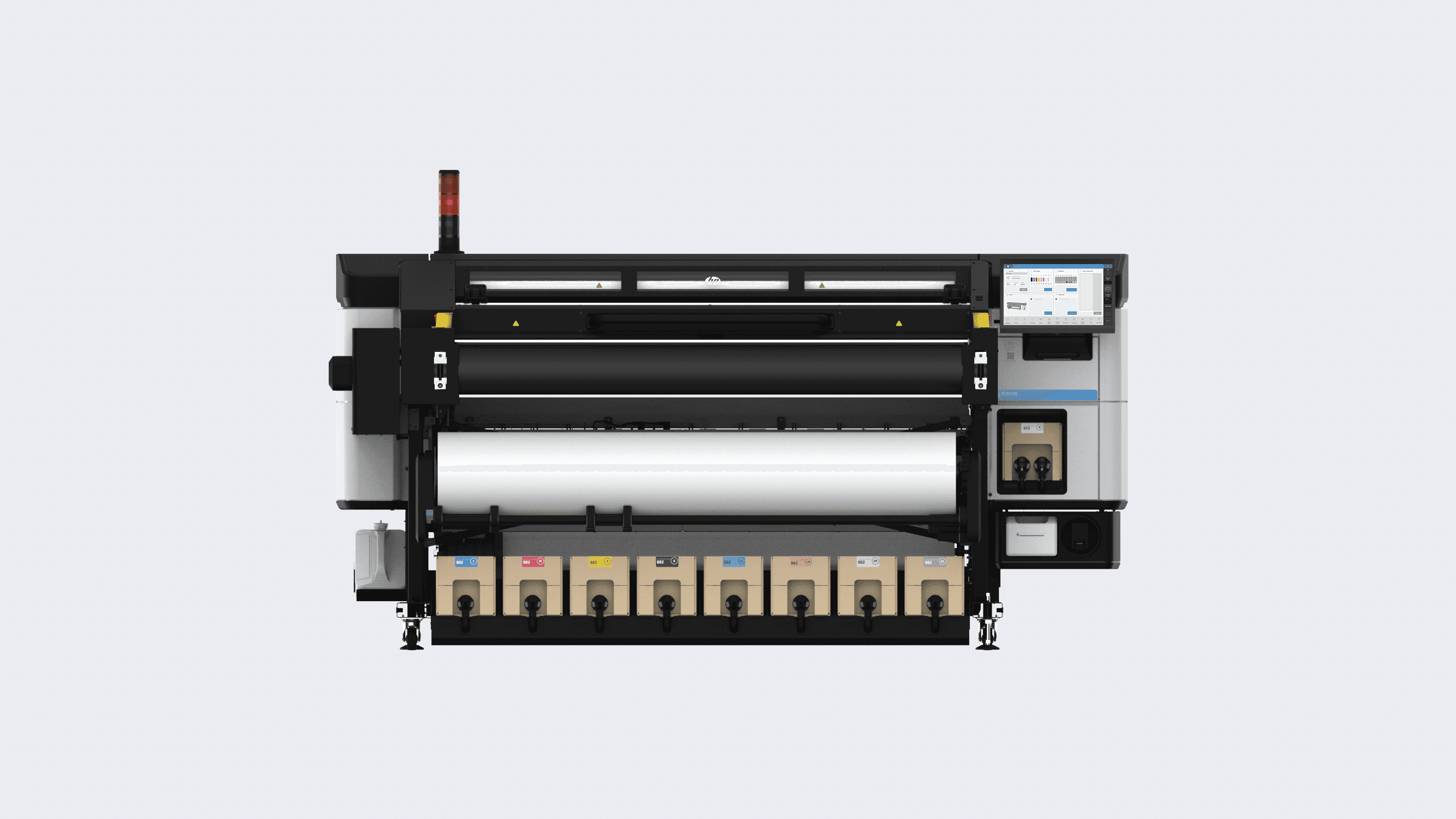
Hewlett-Packard
Use case of how the material loading process of a large format printer was designed.

Graduation project: collaborative learning app design
Revolutionizing the educational ecosystem with a mobile app designed to enhance interactive learning and peer collaboration.